Ways to Make Your Design
There’s no single “right” way to make a screen print design, so this page lays out your options and lets you pick whatever feels good. Every path here lands in the same place, a black and white design at the size it’ll print. Some people love working on a computer, some would rather draw by hand, and both are completely great. If you already have a system that works for you, keep it! And if not, explore some of these cool tools.
Two things first, before you pick a path.
One, whatever you use, your design has to end up solid black and white at final print size (you’ve heard this a few times now, and this probably isn’t the last. It’s that important).
Two, you do not need to be an artist or own fancy software to do this. There’s a path here for everyone, no matter your design preference!
And don’t worry, if you don’t have a printer, you’re not expected to print your own design at home. We will do that together in class, where we’ve got the special tools and systems for it. Your job before class is just to make the design.
First, a quick word: vector vs. raster
Vector art is built from shapes and scales to any size cleanly, raster art is built from pixels and needs to be made at full size and high resolution.
If you’re designing on a computer, you’ll run into these two words, so here’s the plain-English version.
Vector art is made of shapes and lines the computer describes with math, so it can scale to any size and stay perfectly crisp. Blow it up to billboard size and it’s still sharp. Vector is fantastic for bold graphics, text, logos, and clean line work, which is a lot of what screen printing loves. If you’re familiar with Illustrator, that’s what it is.
Raster art is made of pixels, a grid of tiny colored squares, like a photo. It’s wonderful for painterly, textured, hand-drawn-feeling work and anything with detailed shading. The catch is that pixels don’t scale up, so you have to make it at the final size and a high resolution (300 DPI) from the start, or it goes blurry. Photoshop is the famous raster tool.
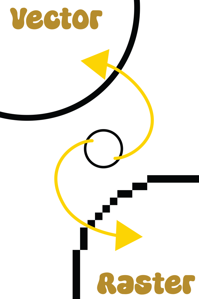
Neither is better. Vector is great for crisp and graphic, raster is great for textural and painterly. Pick whichever matches the look you’re after, or the one you already know.
If you want to design on a computer or tablet
You’ve got great free options, so don’t feel you need to buy anything for this class.
Here’s the rundown on many good softwares. I personally use Illustrator for all my work, but that’s because I already live in it, not because you need it. Any software that gets you to the goal is awesome. These are the ones I recommend, and I can vouch that the free ones live up to the promise.
Vector tools:
- Illustrator (paid, subscription), the industry standard, what I use.
- Inkscape (free, desktop), a genuinely powerful free vector editor, and the one I’d point you to if you want to try vector without paying.
Raster tools:
- Photoshop (paid, subscription), the industry standard for pixel work.
- Procreate (paid, one-time, iPad only), beloved for drawing and painting on an iPad, very natural if you like drawing by hand but digital.
- GIMP (free, desktop), the long-standing free Photoshop alternative.
- Photopea (free, in your browser), runs in a web browser, opens Photoshop files, nothing to install. A great no-cost starting point.
Does both vector and raster:
- Clip Studio Paint (paid, one-time), a favorite for illustration and comics that handles both vector and raster in one place.
Something a little different:
- Canva (free, with paid extras), not a traditional design tool, but it has a big built-in library of graphics and is easy to use. Drawing from scratch in it is limited, but for some people it’s a great, low-stress way to assemble something. Worth a poke if the other tools feel intimidating.
Designing in raster? Set your canvas to 300 DPI at the final print size before you start. This is the one setting that trips people up. More on why over on Keeping It Printable.
If you’d rather draw by hand
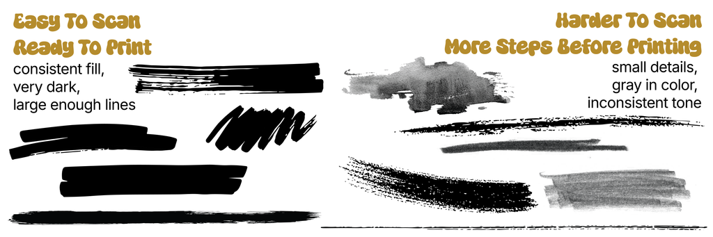
Draw it on paper in solid black and we can scan it in, just keep your lines bold enough to hold up.
Not a computer person? Perfect, some of the best designs start on paper. Draw your design in solid black (a marker, a brush pen, or ink works better than pencil, which scans faint), and we’ll scan it in and turn it into a screen. A few things to keep in mind:
- Work in solid black on white paper, the bolder and cleaner the better.
- Draw at or near your final size, and keep your lines thick enough to survive (this is where the chunky-lines rule matters, see Keeping It Printable).
- Anything you can draw solid and bold, we can print. Sketchy, faint, or super-fine pencil work is the only thing that struggles.
This route is wonderful because it keeps your hand’s natural character in the design, wobbles and texture and personality and all.
Or draw straight onto the acetate
Prefer to draw by hand and skip the computer altogether? Come in with your drawing, and we’ll get it onto acetate together in class.
Here’s the most hands-on option, and honestly a really fun one. The screen gets made from a transparent film (acetate) with your design on it in opaque black, and you can draw your design directly onto that film, no computer, no scanning. What you draw is exactly what prints.
You don’t need to buy anything or do this part at home. Come in with your drawing or a clear idea, and we’ll talk through how to get it onto the acetate together. You’ll have time during class, plus Saturday evening, to keep working on it solo to really finish it off. A few things worth knowing:
- We’ll use Posca markers for this, which are great, opaque, and easy to work with. India ink is also wonderful if you want to try that.
- You’re drawing at exactly print size, since this film IS the thing we burn, so the size guidance applies directly.
- It’s immediate and tactile, and a little unforgiving (harder to undo), so it rewards a confident, bold design.
Great for bold graphic work, hand-lettering, and anyone who likes making marks for real instead of on a screen.
Starting from scratch feels hard? Borrow a starting point
You don’t have to draw everything yourself, there are great libraries of free shapes and images to build from.
If a blank page is intimidating, you don’t have to start from nothing. There are big libraries of icons, shapes, and black-and-white images you can use as a base and make your own. A few good places to look:
Vector / icons (great because they’re already clean and scalable):
- The Noun Project, huge library of simple icons, tons of them free.
- SVG Repo, thousands of free vector graphics.
- Flaticon / Iconfinder, big icon libraries, free and paid.
- Openclipart, free public-domain vector clip art.
- Adobe Stock (paid), the one I use, huge and high-quality if you have access.
High-contrast / black-and-white imagery and public-domain art:
- Openverse and Wikimedia Commons, free, openly-licensed images.
- Public domain collections (old engravings, vintage illustrations from museum open-access archives), gorgeous, bold, and free to use.
- Google Images, a great, fast way to find a starting point, just be extra careful with licensing here since it pulls from everywhere (more on that below).
A quick word on borrowing. It comes down to the license. Anything marked public domain or free to use is safe to lift and build with directly, and it’s totally fine to assemble a whole design out of stock pieces. If you don’t know the license, err on the side of caution and treat it as inspiration instead, let it spark your own version rather than lifting it. Either way, whatever you use still has to become solid black and white and pass the detail check before it’s ready.
However you make it, digital or by hand or straight on the film, the goal is the same, a black and white design at the size it’ll print. Pick the path that sounds fun, and don’t overthink the tool. The best one is whichever gets your idea out of your head and onto our screen.