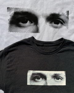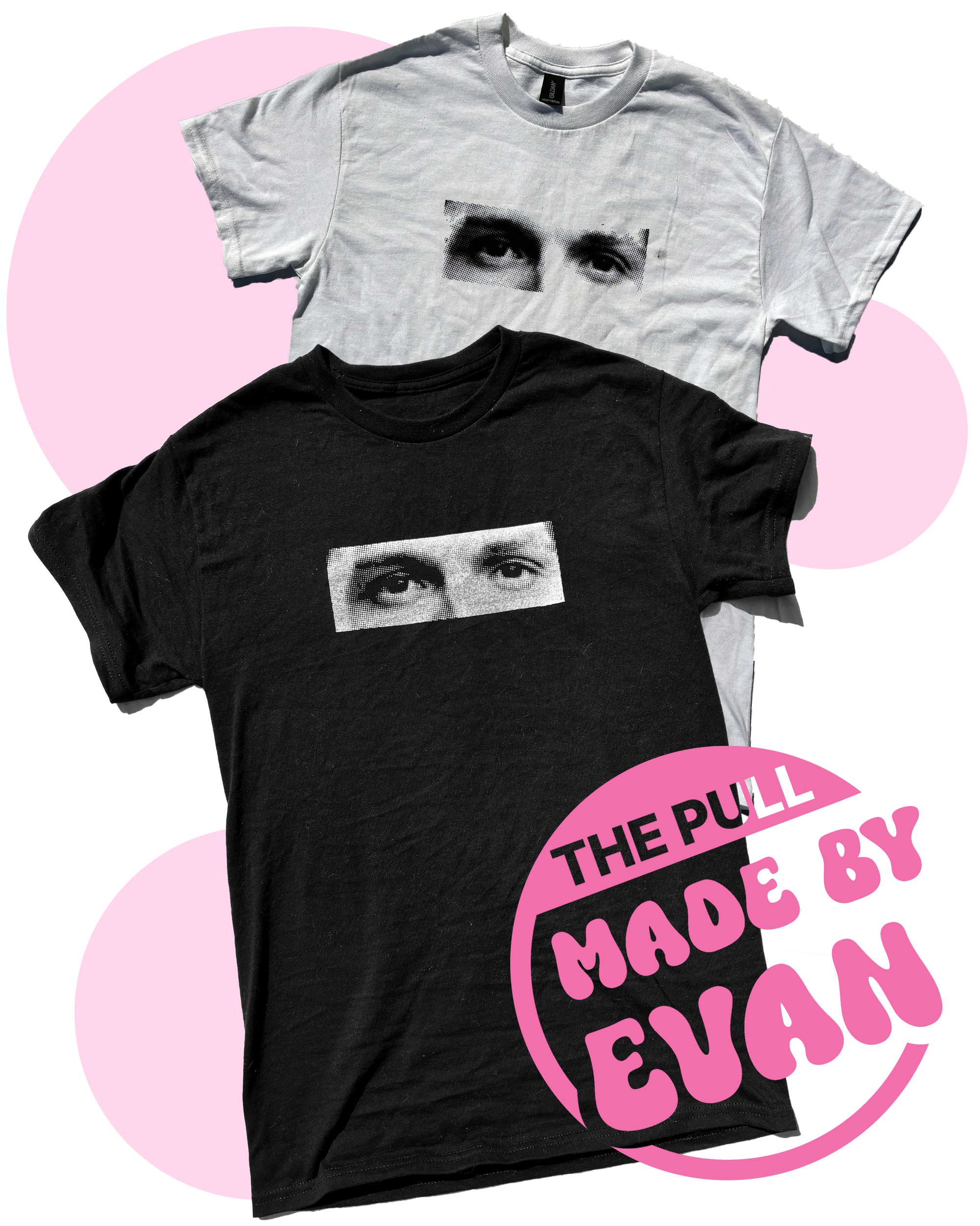
Do you know whose eyes these are?
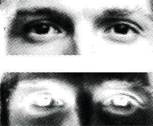
While this is the same photo on both the light and dark backgrounds, the design and screen are not the same. To make the white shirt, I first made the image B&W, then applied halftones to it, so it was dark dots on white. If I did the same for the black shirt, the shades would look inverted, so instead, I inverted the image first before half toning, so while it was still black dots on a white background, when I pull white ink through, it will become white dots on a dark background, correctly inverted. This is a moment where having to design black on white can be confusing!
This style of inverting is very fun to play with, because I could always invert after half toning (before printing) and I would end up with with little stars instead of dots. If you plan on doing something similar, I suggest messing around with the order of steps, and making sure to frequently recolor the dots (where black is ink color) to see if its giving the correct impression!
This design is 8″x2.9″, with an LPI that I forgot to note down. If I had to remake this shirt, I would probably make the design a bit bigger, and work on centering the eyes inside their cropped rectangle better.