Keeping it Printable
This is the one page everybody should read. No matter how simple or wild your design is, it has to survive being squeezed through a screen, and that puts a floor on how fine your details can get.
Good news: the rule is simple, and you’ve got two speeds here. Every section starts with a one-line takeaway in bold, read just those and you’ll sketch just fine. Want exact numbers to work to? They’re right under each takeaway. Grab whichever speed you need.
The whole page in one line: keep your ink details at least 3pt thick, keep your empty gaps at least 5pt, and design at your real, final print size. That’s it. Everything below is just the why and the how to check.
Design at your real size (this one bites people)
Build your file at the actual final print size, and if you’re in pixels, set it to 300 DPI before you start.
Before any number means anything, one rule rules them all: build your design at the actual size it’ll print. A 10-inch-wide design should be a 10-inch-wide file. If you design small and blow it up later, your crisp lines turn to mush. If you design huge meaning to print small, your safe details shrink below the floor.
- Working in vector (Illustrator, Inkscape)? You’re mostly safe, vector scales cleanly, but still set your artboard to the real print size so your point measurements mean something.
- Working in raster (Photoshop, GIMP, Procreate)? This is the big one 👇
Raster people, read this twice. Set your canvas to 300 DPI at the final print size before you start drawing. Not after. A pixel only has a real-world size once the resolution is locked, a “13px line” is chunky at 72dpi and hair-thin at 300dpi. Start at 300dpi/final-size and every pixel number on this page just works. Start wrong and no number will save you.
- Drawing by hand (paper or acetate)? Your ruler is your resolution, just draw at the size it’ll print. On acetate you’re drawing the negative directly, so what you draw is exactly what prints: a ruler and these millimeter numbers are all you need.
→ More on picking your tool: Ways to Make Your Design
How thick is thick enough?
Keep ink at least 3pt (~13px / ~1mm) and gaps at least 5pt (~21px / ~2mm).
Here’s the floor. Stay at or above these and you’re in safe territory:
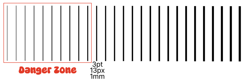
Minimum ink (positive) detail, lines, marks, standalone dots:
| Your tool | Minimum |
|---|---|
| Vector | 3 pt |
| Raster @300dpi | ~13 px |
| Hand / ruler | ~1 mm (1/16″) |
Minimum white space, knockouts, gaps between elements:
| Your tool | Minimum |
|---|---|
| Vector | 5 pt |
| Raster @300dpi | ~21 px |
| Hand / ruler | ~2 mm (just under 1/8″) |
Why is white space thicker than ink? A thin gap is the most fragile thing in a print. It’s where the emulsion on your screen is thinnest (so it can break down), and where ink most wants to bleed in and close the gap up. So negative-space detail needs a little more room than positive detail. (This is the flip side of the negative-space idea from The One-Color Mindset: the shirt-showing-through parts have limits too.)
Smaller can work, but know what’s working against you
3pt/5pt is a safe floor, not a hard wall. Go smaller on purpose, never by accident, and go chunkier when unsure.
3pt and 5pt aren’t hard walls, people print finer all the time. But the smaller you go, the more things can go wrong, and it’s worth knowing why so nothing surprises you:
- Ink bleed: ink spreads slightly as it soaks into fabric, fattening thin lines and closing small gaps.
- How you pull: pressure, speed, and angle all vary by hand, and fine detail is where that variation shows up most.
- Emulsion fallout: very fine detail can wash out of the screen entirely during rinse.
- Blurry prints: to get your design on acetate, we have to make two copies. When we line these up, that doubling can add a touch of blur, so tiny details soften.
None of this means “don’t try fine detail.” It means 3pt / 5pt is your confident floor. Go below it knowingly, not by accident, and don’t be shocked if the tiniest stuff disappears. When in doubt, go a touch chunkier; you’ll almost never regret it.
Text: forget point size, watch the thin bits
It’s never about the font size, check that the thinnest stroke in your letters clears 3pt.
Text is the trickiest thing to size, because “minimum font size” is a lie, it depends entirely on the font. A chunky font at 12pt might be totally safe, a delicate one at 12pt might vanish.
So here’s the real rule: ignore the font size and look at the thinnest stroke in the letters. Hold your 3pt minimum up against the skinniest part of a letter, the thin curve of an “e,” the stem of an “l,” the tail of a “y.” If that thinnest part clears 3pt, you’re good. If it doesn’t, size up or pick a heavier font.
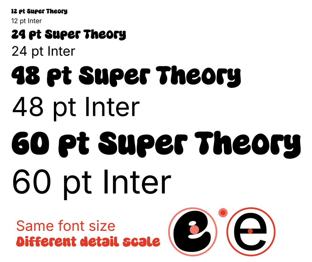
This is also a good argument for bold, chunky lettering in prints generally, it’s forgiving, it reads from a distance, and it just prints well.
That’s the printable checklist. Design at real size, keep ink above 3pt and gaps above 5pt, watch the thin bits in your text, and go chunkier when unsure. Do that and your design will make it through the screen looking like you meant it to.