Going Deeper
Welcome to the rabbit hole. Everything here is totally optional, you can make something you love without reading a word of it. But if One-Color Mindset got you curious about how some of this actually works, this is where we get into it.
This is also the page worth bookmarking. It’s the one you’ll come back to when you’re mid-design and thinking “wait, how do halftones actually…?” Read it end to end, or jump straight to the part you need.
Jump to:
Negative space, pushed further
How you define a shape, with a line around it or as a carved-out solid, changes its whole feel, no matter which color is ink.
You already met the big idea over on One-Color Mindset: the un-inked areas are shapes you design on purpose. This section is more about the why than the how, because once you start thinking this way, it changes how you design everything.
Lines vs. carved-out shapes. Here’s the deeper idea: it’s not just what you draw, it’s how you define it. You can define a shape with a line (an outline around it) or as a filled shape (a solid area, with the edges carved out of the space around it). Same flower, but one is drawn with outlines and the other is a solid form with petals carved into it, and they feel completely different, no matter which color is ink. An outline feels light, open, sketch-like, a carved solid feels bold, weighty, graphic. That choice, outline it or fill it, is one of your biggest expressive levers, and it’s got nothing to do with which color you’re printing.
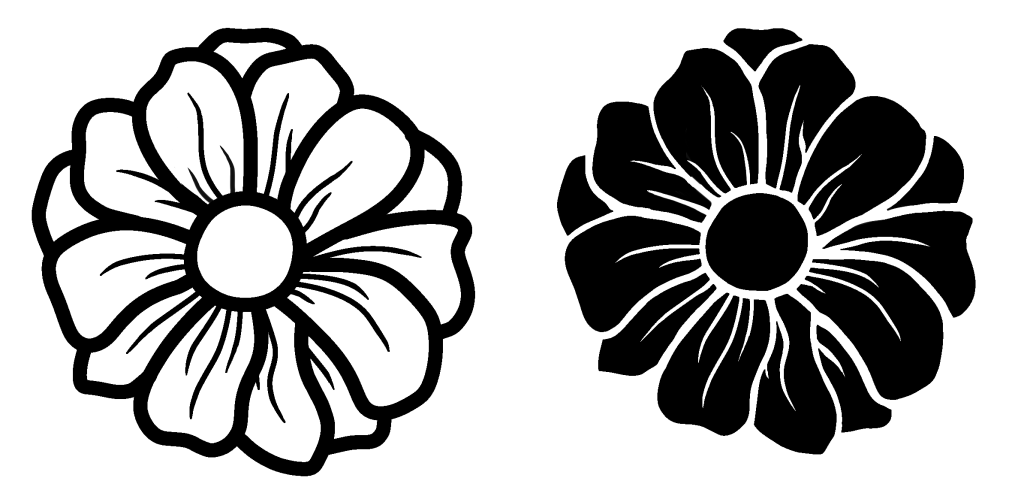
Use a big solid area when the subject asks for it. You might build a large solid form because the subject is that, a bold, heavy subject wants mass, an open, delicate one wants space and line. Some times we also design based on the color of an object, treating naturally light and dark colors differently. The subject and the mood drive the choice. A whale, a mountain at night, a bold emblem, these want a dark fill, a solid weight. A dandelion, a wisp of smoke, a light sketch, these want air, or a lighter area of a design.
You see this everywhere. Carved-out shapes are the backbone of great logo design; the hidden arrow in FedEx, shapes formed between the marks rather than by them. Nature and the world are full of it too: silhouettes at sunset, shadows, light through leaves. Part of getting good at one-color design is just noticing how shapes get defined out in the world, outlined, or carved from a solid, then stealing how it works. Once you see it, you can’t unsee it.
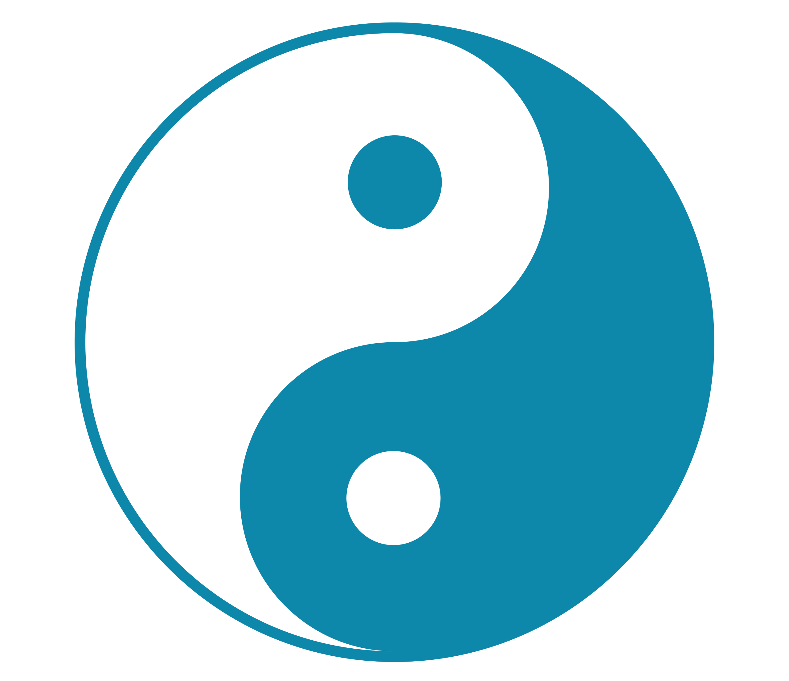
Balancing fills AND lines in one piece. The real fun is using both at once, solid carved shapes and delicate line work in the same design. Solid forms anchor it, fine lines give it detail and breathing room. All-solid can feel flat, all-line can feel weak, playing them against each other gives depth and rhythm. You’ll find this in tattoo flash, woodblock prints, band posters, anywhere one color has to do a lot of work.
Now the practical side, how to make negative space actually survive the print:
Trapped (enclosed) space, and why you’d want it. There’s a difference between space that’s open to the edge of your design and space that’s fully surrounded on all sides a section boxed in by what’s around it. Here’s why you’d use it: a trapped patch of shirt inside a solid field becomes a bright highlight punching out of it, a glint in an eye, a spark of light in a shadowy design. Trapped space is your highlight tool.
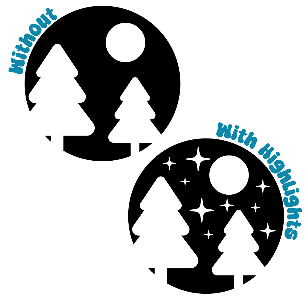
The catch is that trapped space is also the fragile kind. Those enclosed patches are the first thing to close up when ink bleeds or your print shifts slightly, the smaller and more enclosed, the riskier it can be (this is exactly what the 5pt gap minimum on Keeping It Printable is protecting). So use trapped space for its highlight power, but keep those patches generous. If you’ve got lots of tiny trapped bits (fine filigree, little sparkles), expect some to fill in, and design so it still reads if they do.
Design so it survives. The move is to make your design read even if the finest bits close up, the eye forgives a little fill-in if the big shapes are strong. Don’t build something that only works if every hair-thin gap survives perfectly.
Negative space opens up options you won’t get from line work alone, but never hesitate to use both to get your design across.
→ Want to see this in practice?
→ Back to: One-Color Mindset, Negative Space
Halftones, for real this time
Halftones are just dots of one ink faking a tone, and a few big dots or many tiny dots can read as the exact same gray, depending on how far away you stand.
Over on One-Color Mindset we said: no gray ink, so fake it with dots. True. Here’s how it actually behaves, both the theory that makes it click, and the practical stuff that keeps it alive on press. And note: you don’t need to know how to make one to understand this, many tools can turn a gradient into a halftone for you. This is about knowing what you’re looking at and what to ask for.
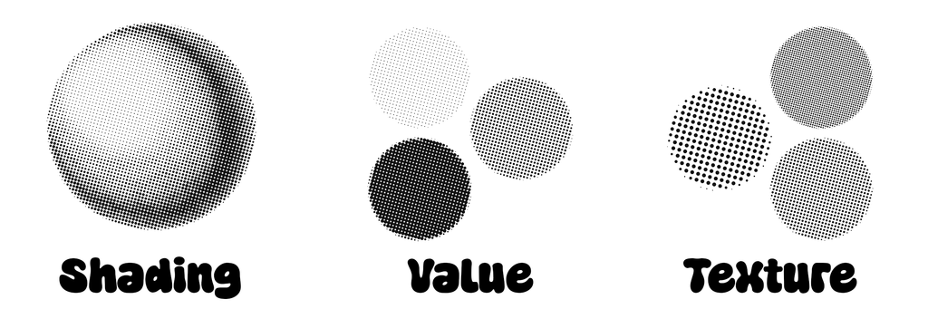
The big idea: it’s all about density and distance. Here’s the thing that makes halftones click. A “50% gray” can be made from big fat dots that cover half the area, OR from tiny dots that also cover half the area, and they’re the same gray. What changes is how close you have to stand before your eye stops seeing “dots” and starts seeing “gray.” Big chunky dots read as gray from across the room but look like a pattern up close. Tiny fine dots read as smooth gray even from a foot away. Same tone, different resolution. That’s the whole trick: you’re trading “how smooth it looks up close” against “how well it survives printing,” and chunky always survives better.
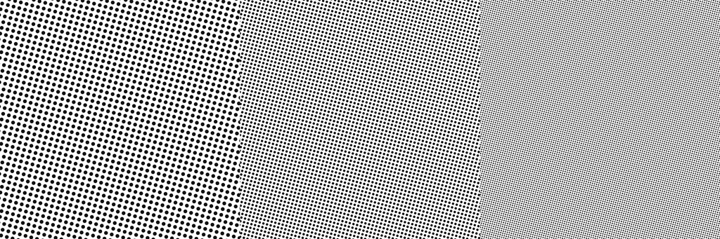
Halftones aren’t only for gradients. Easy to think a halftone is just a smooth fade, but it’s just as useful as a flat area of tone, a solid field of evenly-spaced dots that reads as one steady gray. This is the comic-book move: big flat areas of dotted “gray” (Ben Day dots), used as a whole tone, not a transition. So a halftone can be a smooth gradient or a flat fill or texture, anywhere you want a value that isn’t full ink or bare shirt.
Why and where you’d use them. Halftones buy you three things one flat color can’t: shading (make something look round and dimensional), flat mid-tones (that comic/retro gray without a second screen), and texture/vintage feel (visible dots read as handmade, screen-printed, old-school, a look people love). Great places for them: skies and gradients, shadows on an illustration, a vintage photo effect, comic-style shading, or just adding a second “value” so a one-color design doesn’t feel flat.
Now the practical side, keeping halftones alive on press:
How the dots actually print. Big dots (the dark areas) are sturdy. The danger is the light end: the tiniest dots. Those are the single hardest thing in screen printing to hold, they wash out of the screen when you rinse, clog with ink, or just don’t transfer. So a gradient that fades all the way to nothing will usually lose its lightest tones. Plan for your lightest dots to drop out, don’t rely on them.
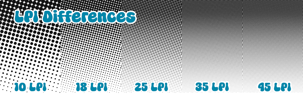
How fine is too fine (some numbers to think about). The coarseness of a halftone is measured in LPI (lines per inch), lower LPI = bigger, chunkier, more spaced-out dots, higher LPI = finer, smoother, denser dots. Commercial shops with pro equipment run high LPI. For hand-printing on a setup like ours, you want to go much coarser than you’d think, think low, chunky LPI (roughly the 10–35 LPI neighborhood is a common starting point for hand work, versus 55+ for pro setups). But I’ll be straight with you: I don’t hand you an exact number as gospel, because the right LPI depends on our mesh, exposure, and how you pull, so treat coarse-and-chunky as the goal, and we’ll test the actual sweet spot together in class. When in doubt, coarser.
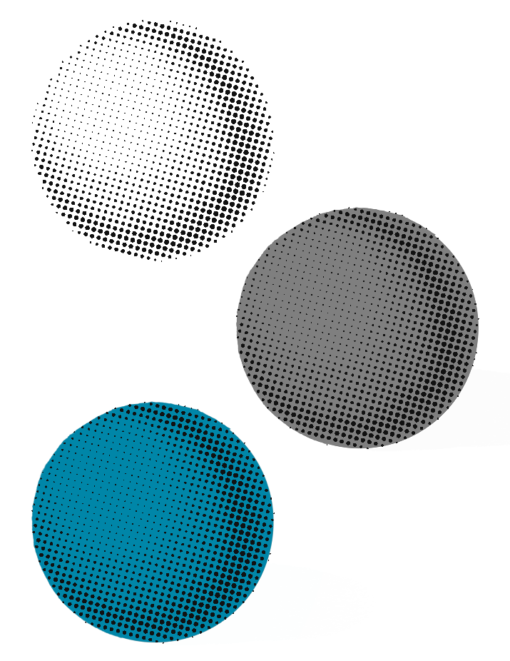
Build it so you can tweak it (this saves you between sessions). We’ll spend time on halftones together in class, and I’ll have an example we can pull so you see how they behave for real. Because of that, build your halftone so it’s easy to change your mind about. Fair warning: Photoshop and Illustrator are both a little rude about halftones, once you apply one it can be a pain to undo or adjust. So set yourself up to modify it easily: keep the halftone separate from your main artwork rather than baking it directly in, so you’re not starting over if you want a different look. Once we’ve tested what our setup actually likes, you might want to adjust your dot size or coarseness, or you might love it exactly as is! Either way, you’ll be glad it’s easy to change instead of locked in.
Contrast between ink and shirt. Halftone shading is an illusion your eye assembles from dots, and that illusion needs contrast. High contrast (dark ink, light shirt, or vice versa) = crisp dots, convincing shading. Low contrast (mid-gray ink on a black shirt) = dots blur together, shading goes subtle, moody, sometimes muddy. Neither is wrong, contrast is the dial between “punchy and clear” and “soft and atmospheric.”
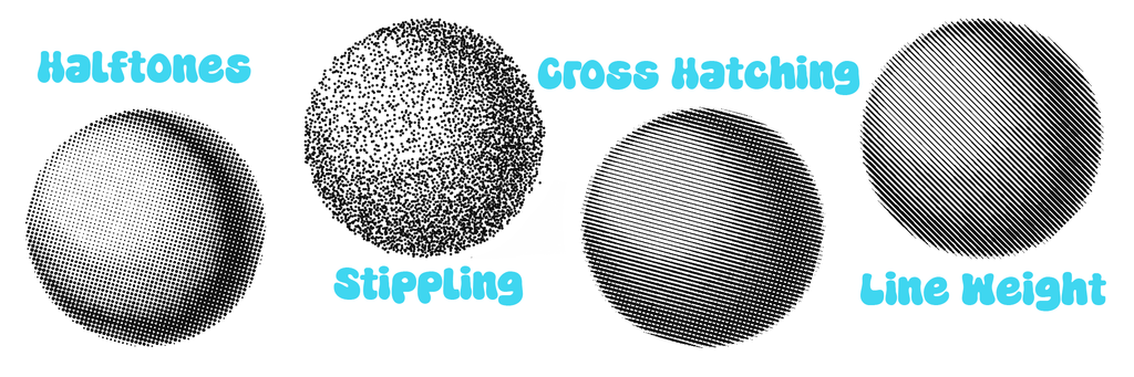
Other density tricks (same principle). The underlying idea, density fakes a tone, also covers hand techniques: crosshatching, stippling, line weight that thickens and thins. These are often friendlier than true halftones because you control every mark and nothing’s too fine by accident. If halftones feel finicky, hand-drawn density gets the same effect with more control.
→ See how others have used halftones
→ Back to: One-Color Mindset, Halftones & Shading
Multiple colors & registration
For this class, two colors is the real ceiling. Line them up by hand, design for overlap, and if it lands a little off, that glitchy look is a feature, not a bug.
One-Color Mindset gave you the headline: more colors = more screens, lined up by hand. Here’s what that actually involves, and what’s realistic with what we’ve got this weekend.
The honest class limits. Each color needs its own screen, and you are building two frames, so two colors is our realistic maximum. Your frames are 16×20, which gives about a 12×16 printable area once you leave margin for the squeegee. (You could squeeze a third/fourth color if your design is small, under about half the frame, by fitting more than one color’s artwork on a single screen, but that’s a tight, advanced move, not really what we’re set up for. Plan for two.) One color is a joy, two is very doable, treat three as “maybe someday with more frames.”
What registration is. You print color one, then line up screen two exactly over that first print, then pull your print. That alignment is “registration.” Get it right and colors sit together perfectly, a hair off and you get gaps or overlaps where colors meet.
Why it’s harder than it sounds: the fabric moves. Unlike paper, a shirt stretches, shifts, and breathes, even as it dries between colors. The garment you lined up perfectly can shift a little, so your alignment is always chasing a moving target. Nothing to stress about (we’ve got plenty of time in class), it’s just why the overlap tricks below matter.
Registration marks. The trick that makes it possible: small identical marks (little crosshairs or targets) placed outside the design area on every screen. They are placed identically on each colors screen, and are much easier to line up than full pieces of art. When the marks match, the artwork matches.
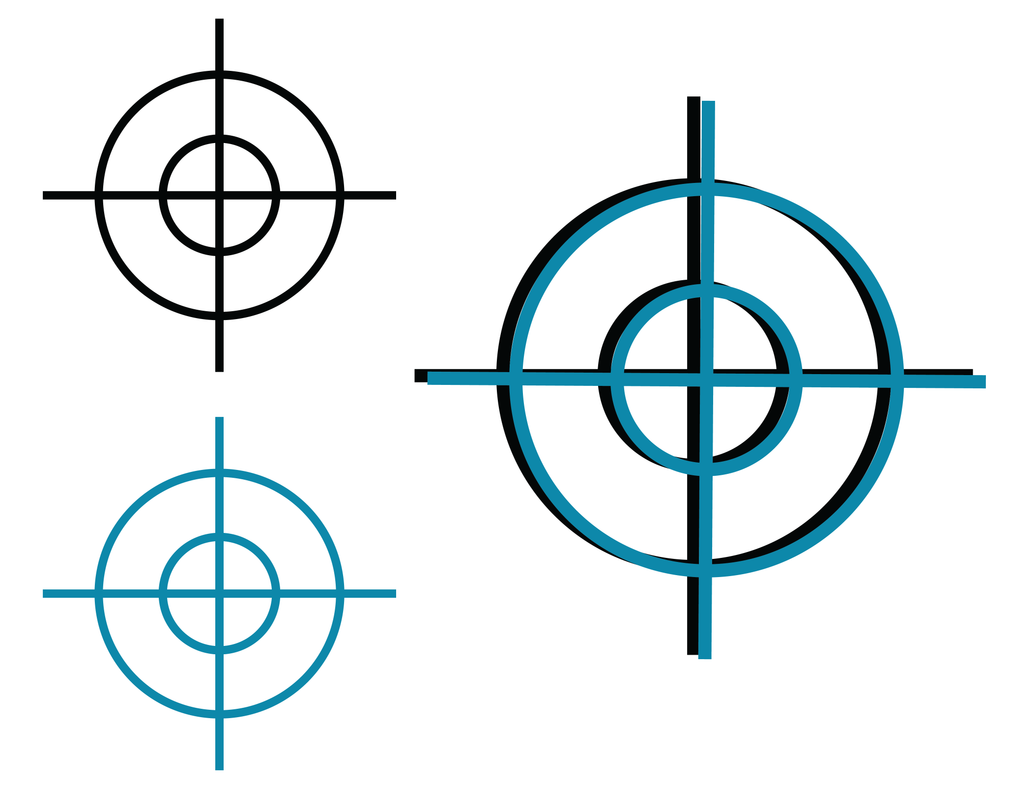
Making your separations: file layers vs. by hand. How do you split a design into one screen per color? The clean way is in your design file: build each color on its own layer, export one image per layer, and burn one screen from each. Because they came from the same file, they’re inherently aligned, the computer did the registration for you, and you just have to line up the marks on press. Doing it by hand is possible but genuinely tricky, you’re tracing each color onto its own screen and hoping your tracings line up, with no guarantee they do. If you’re going multi-color, strongly lean on file layers, hand-separating is for the patient and stubborn.
Designing two colors that forgive each other. Two connected ideas that make hand multi-color survivable.
First, print light to dark, lightest color first, darkest last. Dark ink covers light cleanly, light ink can’t hide dark underneath it. So order matters.
Second, let your colors overlap on purpose. If two colors meet at a perfect edge, any misalignment shows a gap. If they overlap slightly (“trapping”), a small registration error just hides in the overlap. And when you build that overlap, extend the lighter color, don’t thicken your dark linework to cover gaps, because that fattens and distorts your art. Let the light layer be the generous, forgiving one, and your dark layer stays true to the drawing. Rule of thumb: the more your colors overlap by design, the less perfect your registration has to be.
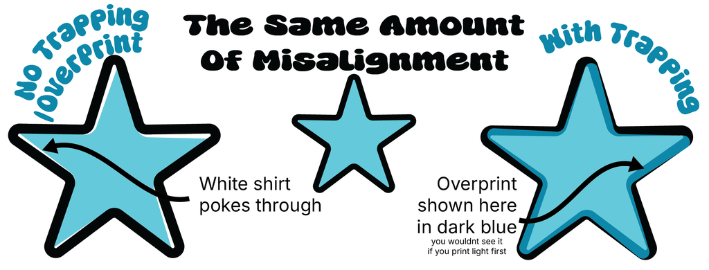
And hey, “off” can look awesome. Everything above is about getting close to perfect registration, and we’ll absolutely work to dial yours in. But here’s the fun secret: misregistration is a whole aesthetic. That slightly-off, colors-not-quite-lined-up look is the glitch effect, the risograph look, the vintage-comic-misprint charm, people spend real effort trying to fake it. Yours will be real, because it’s handmade by you, on a screen you built. So if your two colors land a little off-register and you love it? That’s not a mistake, that’s a look, lean into it. We’ll help you get as close to perfect as you want, but “perfectly imperfect” is a totally legit place to land.
Remember what this is. Doing this by hand, especially if you’re hand-drawing or hand-separating your colors, is genuinely hard, and it takes practice to get tight. So give it your best guess, expect it to be imperfect the first time, and know that this class is for learning at least as much as it’s for perfection. You’re going to walk out understanding how multi-color works and having actually done it, and a wobbly-but-yours two-color print beats a flawless one you didn’t make. Perfection comes later, with reps.
Bottom line. If you want to nail multi-color, design for it, not against it: two colors, light printed before dark, generous overlaps on the light layer, and your separations built in a file. Do that and you’ll walk out with a clean two-color print, or a beautifully glitchy one, and either is a win.
→ Check out where registration was worth it
→ Back to: One-Color Mindset, Multiple Colors
That’s the deep end, and hopefully it’s enough to get you launched. None of it is required, but all of it is here whenever you want it.
A real thing worth saying: this page is a start, not the whole story. Screen printing is deep, and the best way to get good is to keep pulling threads; watch videos, follow printers whose work you love, and above all, make stuff and see what happens. Some of what you learn here will click differently once you’ve got ink on a squeegee. So take this as a map, not a manual.
And here’s the reframe I hope you leave with: the limitations of this medium aren’t in your way, they’re the point. One color, chunky detail, dots faking gray, two screens lined up by hand, those constraints are exactly what give screen prints their look and their soul. The best print designs aren’t the ones that ignored the limits, they’re the ones that leaned into them. Let the constraints push you somewhere you wouldn’t have gone with infinite colors and infinite detail.
Come back to this page mid-design anytime. It’s built to be a reference, not a one-time read, and it’ll grow as we do.