The One Color Mindset
So here’s the big shift, and it’s the one thing that makes screen printing click: we print one color at a time. One screen, one ink, one pass.
That might sound like a limitation. It’s not, it’s a whole design language, and once it clicks you’ll start seeing it everywhere. Some of the best print designs out there use exactly one color. The trick isn’t adding more, it’s getting one color to do more.
This page is the big-picture version, what’s possible and how to think about it. You don’t need to master any of this before class. Just let it rattle around in your head while you’re sketching.
One quick thing before we go further. Everything here is in black and white, and that is how you’ll build your final design for production. But black and white are really just stand-ins. Think of white as your shirt color and black as your ink color, and both of those can be anything. Your “shirt” might be a navy tote, a kraft-paper card, a red hoodie. Your “ink” might be white, gold, hot pink, whatever. So when you see white below, read it as “wherever the shirt shows through,” and when you see black, read it as “wherever the ink lands.” The two colors are up to you, we just design in black and white to keep it clear.
Negative space (your shirt is a color too)
The parts you don’t print are working just as hard as the parts you do.
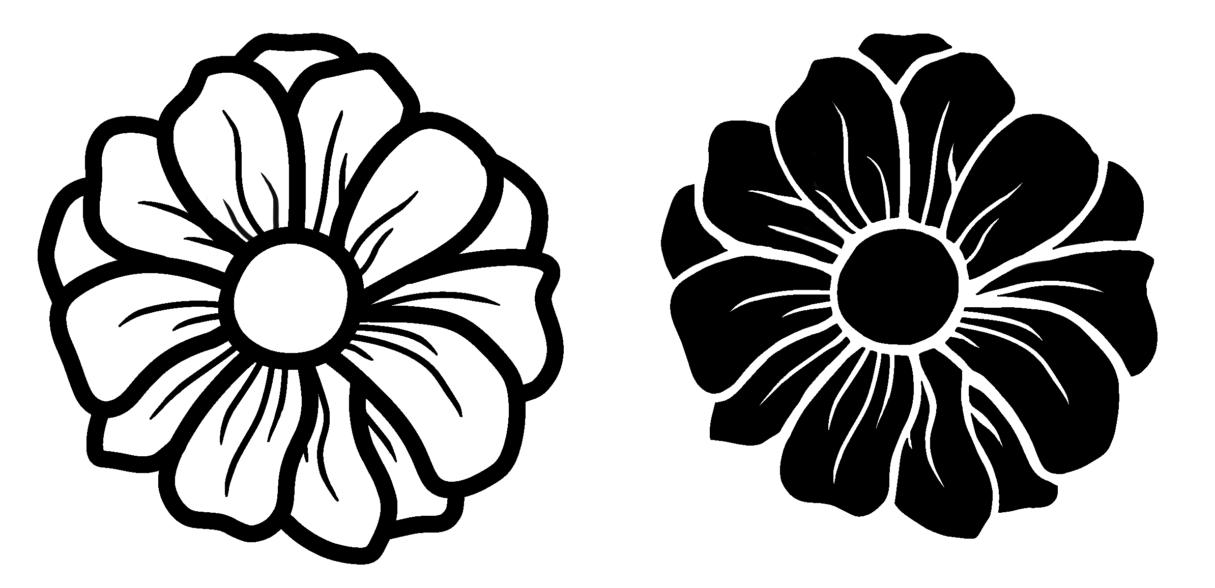
This is the first superpower of one-color thinking: the parts you don’t print are doing just as much work as the parts you do.
Look back at those two flowers. Both are a single ink, and in both, the ink and the shirt work together to make the petals, just in opposite ways. On the left, the ink draws the petals as outlines, and the shirt fills them in. On the right, the ink is the petals and the shirt shows through to define the shapes of them. Same flower, same one color, but which one is “the drawing” completely flips.
That’s the move to practice: instead of only asking “what do I draw?”, ask “what do I leave out?” The un-inked space isn’t leftover, it’s a shape you’re designing on purpose. Sometimes the strongest version of a design is the one where the ink surrounds the subject instead of drawing it.

→ Want to push negative space further? See Going Deeper: Negative Space
Halftones & other ways to fake shading
No gray ink? Fake it with dots. Big dots read dark, tiny dots read light.
Okay, but what if you want shading? A gradient, a fade, a bit of gray? With one color and no gray ink, how do you get there?
You cheat, beautifully. It’s called a halftone: instead of gray, you print a bunch of tiny black dots. Big fat dots close together read as “almost black.” Tiny dots with space between them read as “light gray.” Your eye blends them from a few feet away and sees a smooth shade, but it’s still just one color, one ink, dots of different sizes.
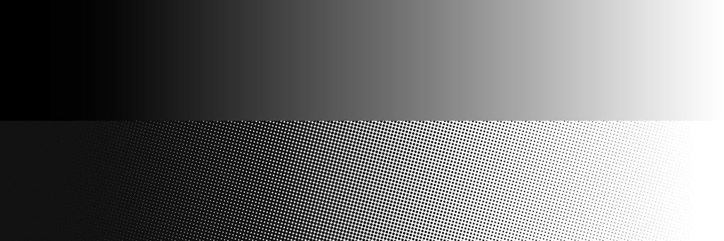
It’s the same trick old comic books and newspapers used. One color of ink, dots doing all the work, and suddenly you’ve got shadows, fades, and depth. There are other ways to fake shading too, like line work that gets denser or thinner, crosshatching, or stippling, all the same principle: let density do what a second color would.
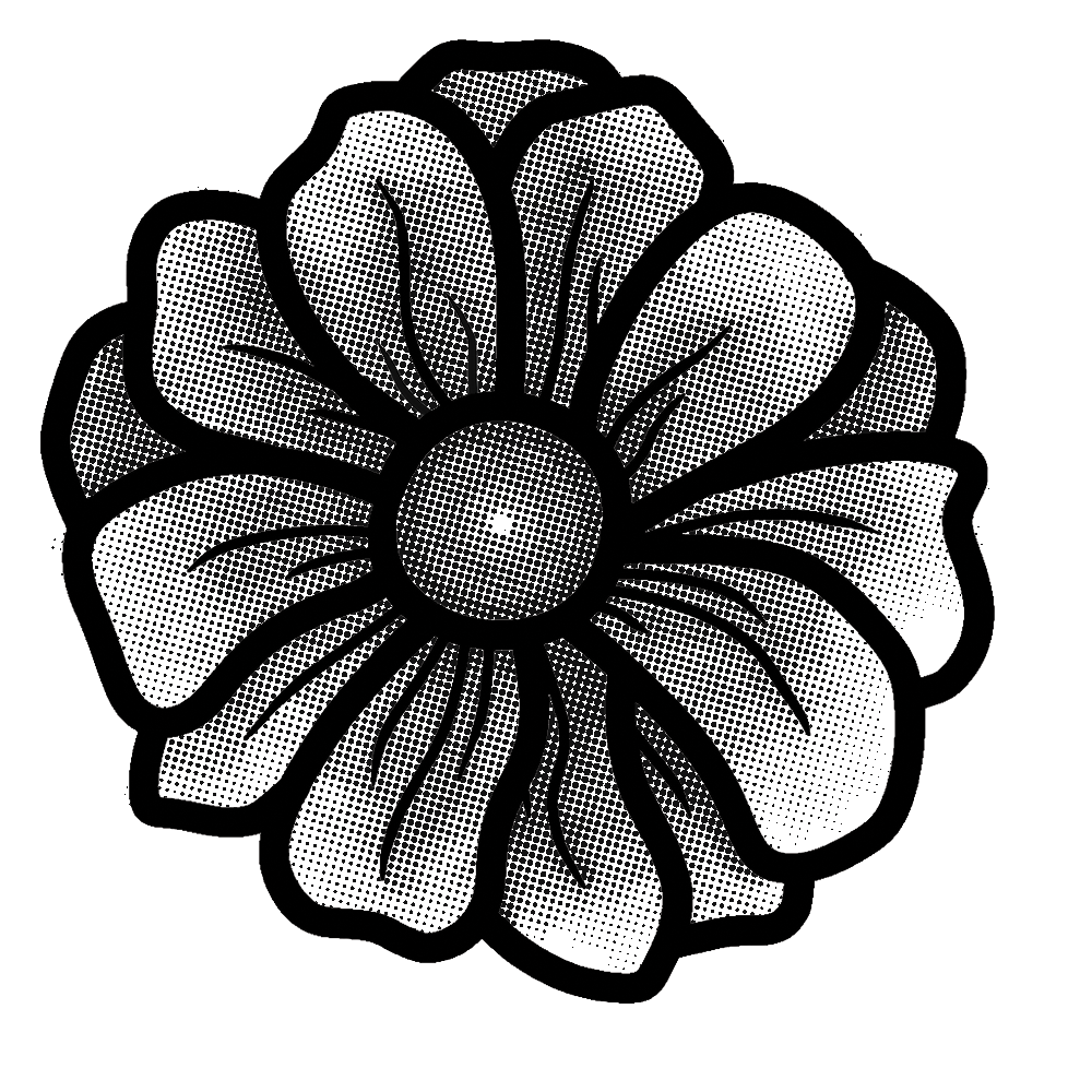
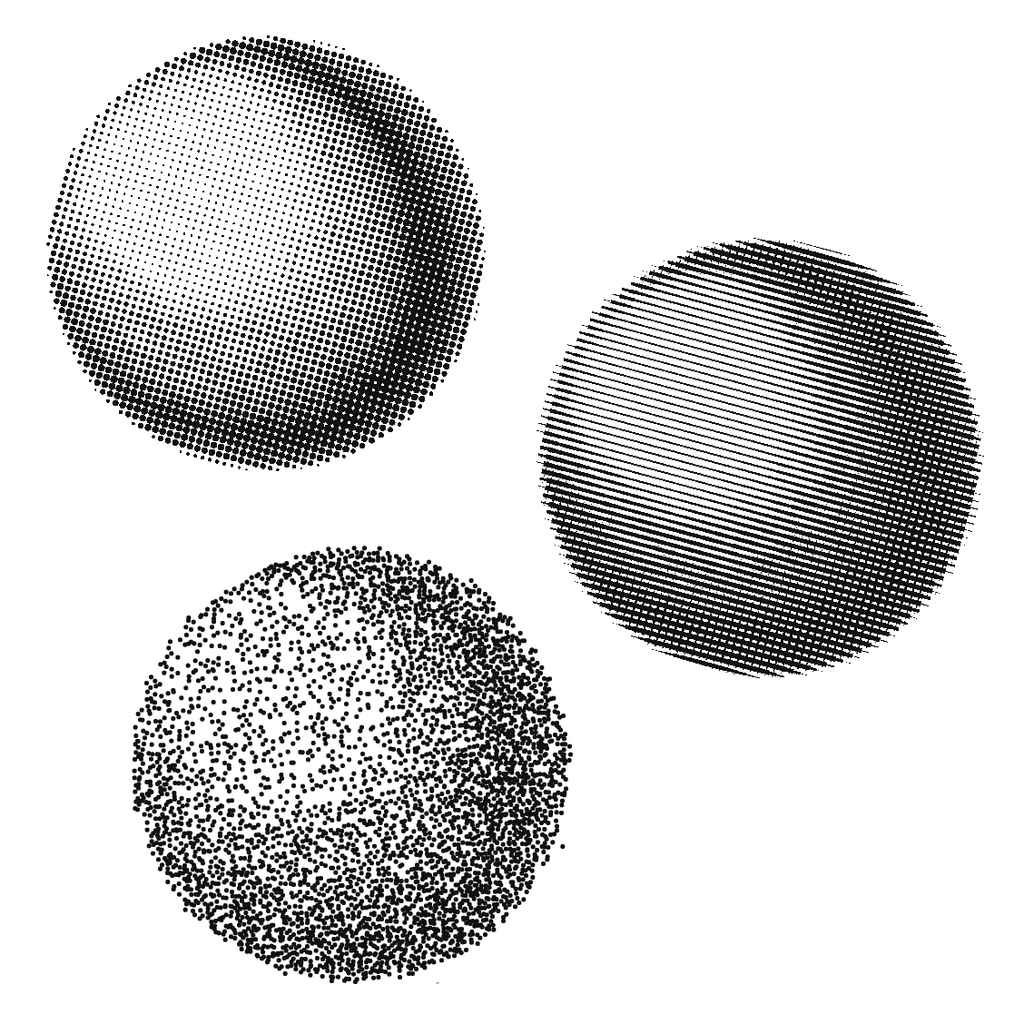
One thing worth knowing: halftones lean on contrast. Dark ink on a light shirt (or the reverse) makes the dots read crisp and the shading pop. Low-contrast combos, like a soft gray on a black shirt, go subtle and moody, which can be gorgeous or can turn to mush depending on what you want. More on picking combos that work in Going Deeper.
Keep it chunky (detail has a limit)
Screen printing can’t hold hair-thin detail, so think bold from the first sketch.
One friendly heads-up while you’re sketching: screen printing can only hold so much detail. Really thin lines, tiny gaps, and teeny dots tend to close up, break apart, or vanish when they hit the screen. It’s not about how good your art is, it’s a physical limit of ink squeezing through mesh.
The fix is easy, and it’s free: think chunky. Bolder lines, a little more space between elements, nothing hair-thin. The flowers up top are a great example; those confident, thick strokes are exactly the kind of thing that prints beautifully.
We’ll get into actual sizes and how thick is “thick enough” on the Keeping It Printable page, but if you keep “chunky” in mind from the first sketch, you’ll save yourself a headache later.
→ The specifics: Keeping It Printable
You can do multiple colors
More colors = more screens, printed one at a time and lined up by hand.
Yes! Multi-color printing is real and we can absolutely do it this weekend, especially if you come in with a design that’s already built for it.
Here’s how it works: each color is its own screen, printed one at a time, and every layer has to line up with the last. That lining-up is called registration, and it’s the part that takes care, a hair off and your colors don’t quite sit right.
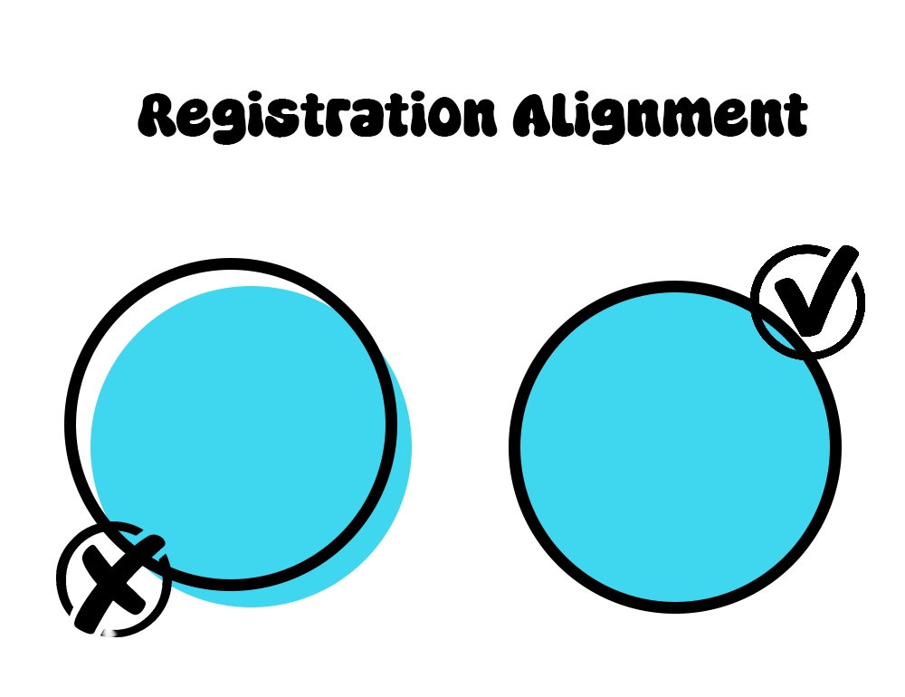
It’s very doable. The main thing to know going in is that more colors means more screens, more steps, and more registration, so if you’re dreaming in multiple colors, come in with it planned out and we’ll make it happen. And if you stick to one color? You’ve already seen how far that can go.
→ Check out these multi-color prints!
That’s the mindset. One color, working hard. Play with negative space, fake your shading with dots, keep it chunky, and don’t feel like you need more colors to make something great.